I designed the whole NutraHive product, on web and mobile, as the only designer.
NutraHive is a nutrition service for working professionals in metro cities. A client picks a certified nutritionist and gets a diet plan built week by week. The meals come from NutraHive's own cafe.
Nothing had been designed when I joined. I designed every screen for clients and for nutritionists, on web and on mobile. I also built the visual and illustration language.
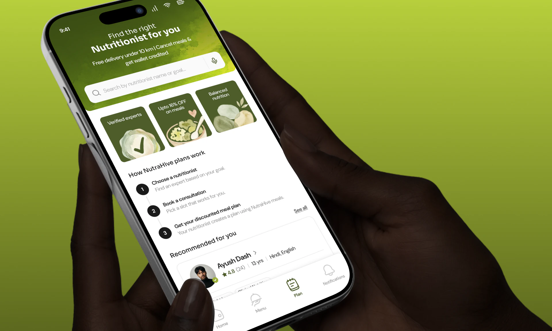
The client app opens on finding a nutritionist, which is the first step of the whole flow.
My Role
I built the product from a rough start.
I did the UX and UI for the client side and the nutritionist side, on web and on mobile. I also created the watercolor illustration style from scratch. I worked with the developers to fix flows while they were building them.
The onboarding illustrations are original watercolors. I explored several directions before settling on this style.
Key Decisions
These are four places where the easy answer would have caused a problem later.
Made the four plans easy to compare
A client picks one of four plans, lasting one, two, four or eight weeks. A single meal costs ₹200. The longer the plan, the bigger the discount.
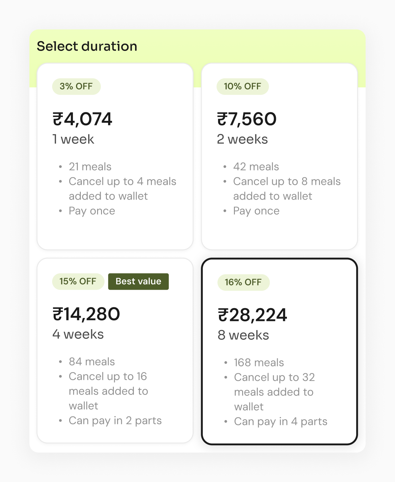
₹14,280
Four week planThis option shows the full cost for all the meals.
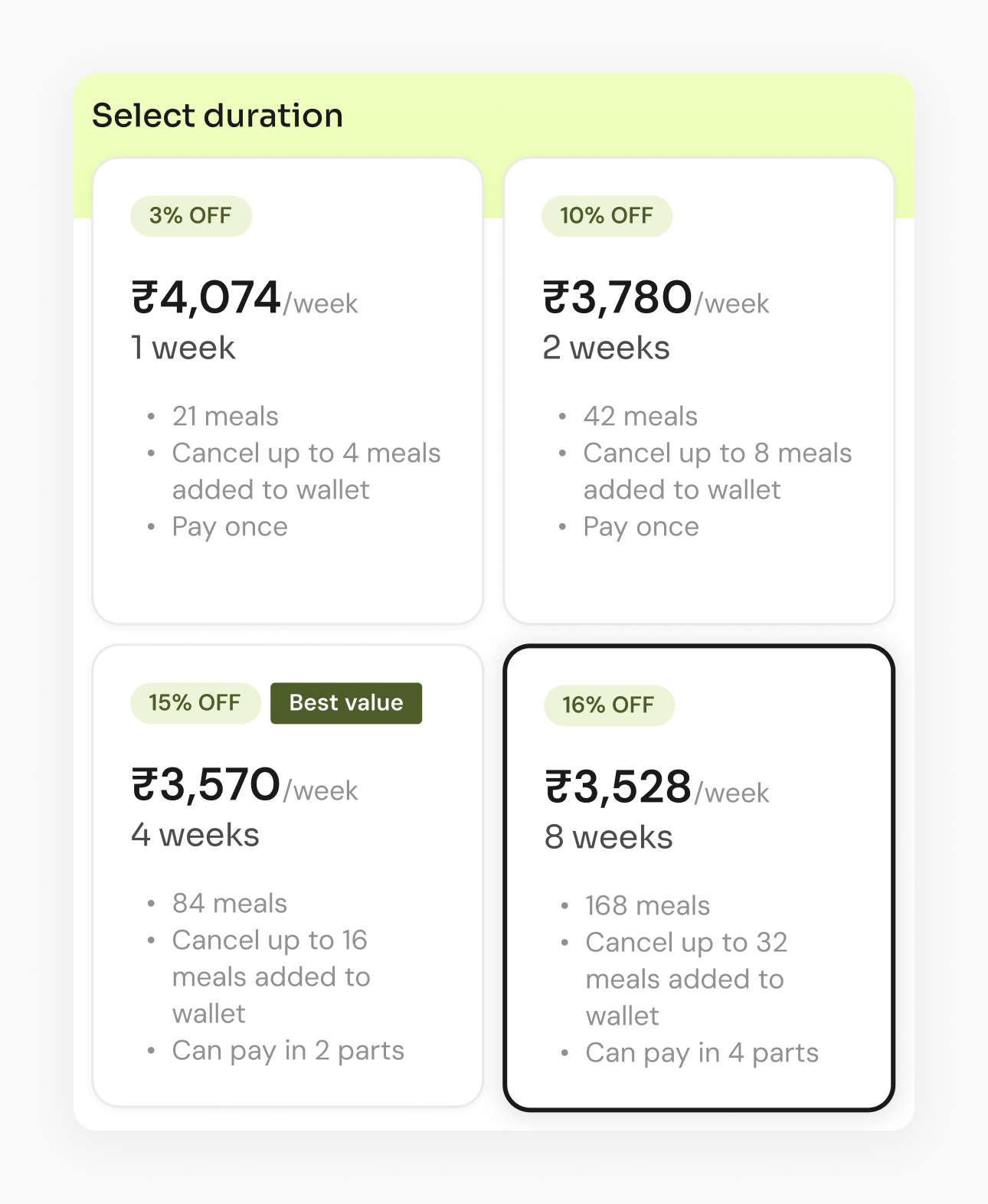
₹3,780/week
Two week planThis option shows the cost for one week of meals.
A price per week makes the four plans easy to compare. The eight week plan costs ₹3,528 a week and the two week plan costs ₹3,780 a week, so the better deal is clear. As totals, a client would have to compare ₹28,224 with ₹7,560. That comparison is much harder to judge.
Closed a loophole in the plan pricing
The four week plan costs ₹14,280. A client can pay it in two parts, and the second part is due after two weeks. If the total is split in half, each part is ₹7,140.
A client can pay the first part, eat for two weeks and leave. The two week plan costs ₹7,560, so that client pays ₹420 less for the same two weeks.
I priced the first part at ₹7,560, so leaving early saves nothing.
The second part is ₹6,720, so the total is still ₹14,280. The eight week plan follows the same rule. The first two parts of that plan add up to exactly the four week price.
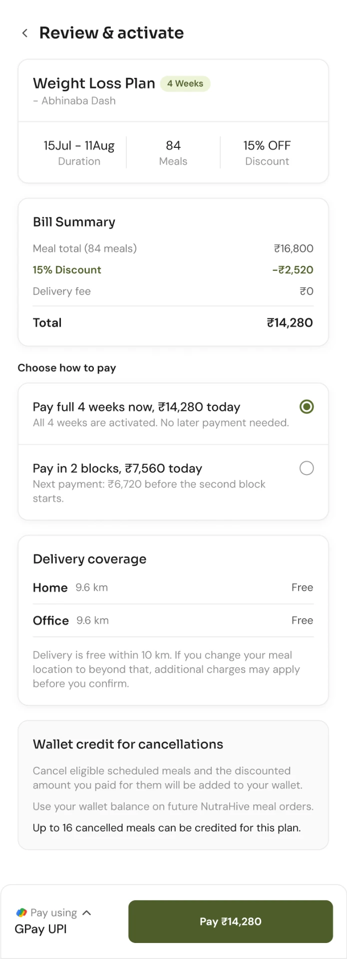
At checkout, the client sees ₹7,560 due today and ₹6,720 due later.
Made signing up faster
A nutritionist needs a client's height, weight, activity level, goals and health concerns to build a diet plan. The question was when to ask for them.
A new client fills in two forms before seeing a single meal.
A new client can browse and order first. The body details come in only when they book a nutritionist.
The app also asks for these details after a client's first two or three orders. Until then, the menu is sorted by what is popular and what that client has ordered before.
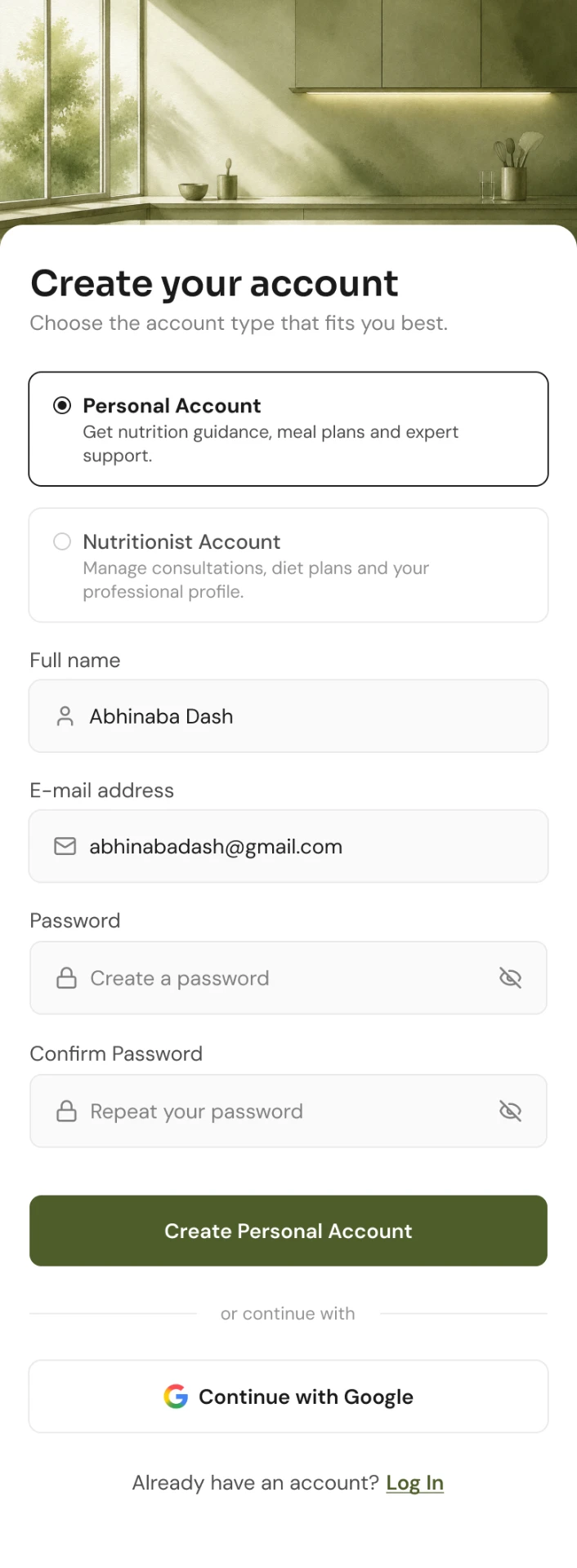
Sign up asks for an account and nothing else.
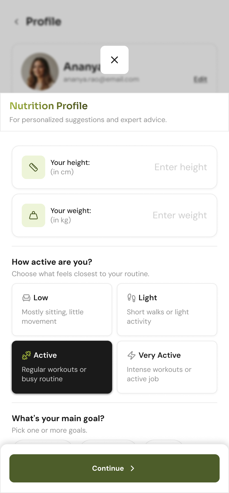
The body details form asks for height, weight, activity level, goals and health concerns.
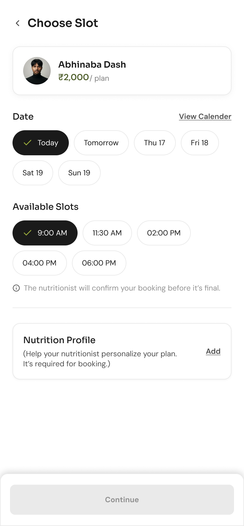
Booking a nutritionist is the one place these details become required. The continue button stays off until they are filled.
Made the plan builder easier to follow
A nutritionist builds a plan in four steps. They pick the client, then the plan, then the meals, and they write a note at the end. The plan decides which meal template loads, so the order matters.
The order already existed, so I built the form around progressive disclosure.
Nothing opens until a nutritionist chooses a plan.
The meal template and the client note stay locked until a plan is picked. The send button stays off until at least one meal is on the week.
Additional Work
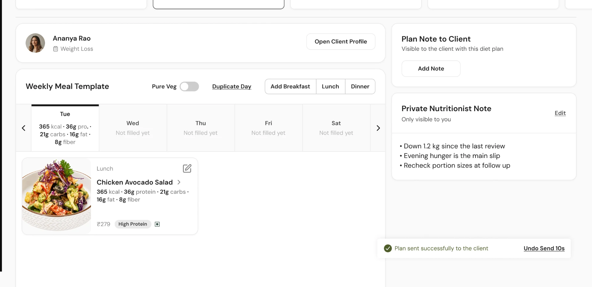
Sending a plan shows a 10 second undo, so a nutritionist can catch a mistake before the client sees it.
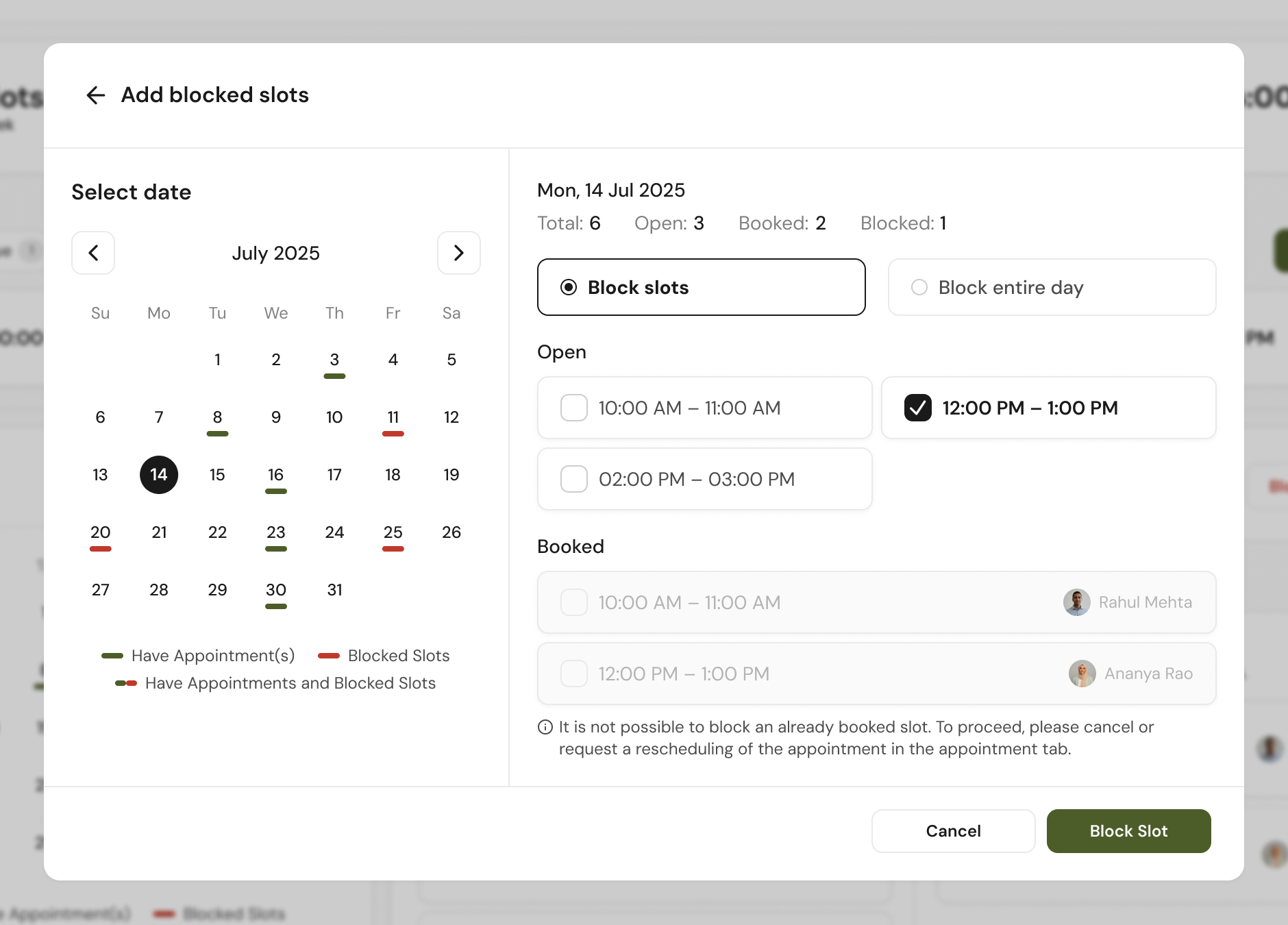
Nutritionists can block their own dates. Slots that are already booked stay locked, with a note explaining why.
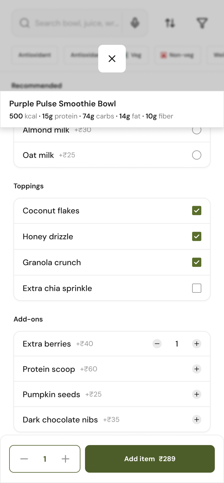
The nutrient values update as a client adds toppings and add-ons, not only for the base dish.
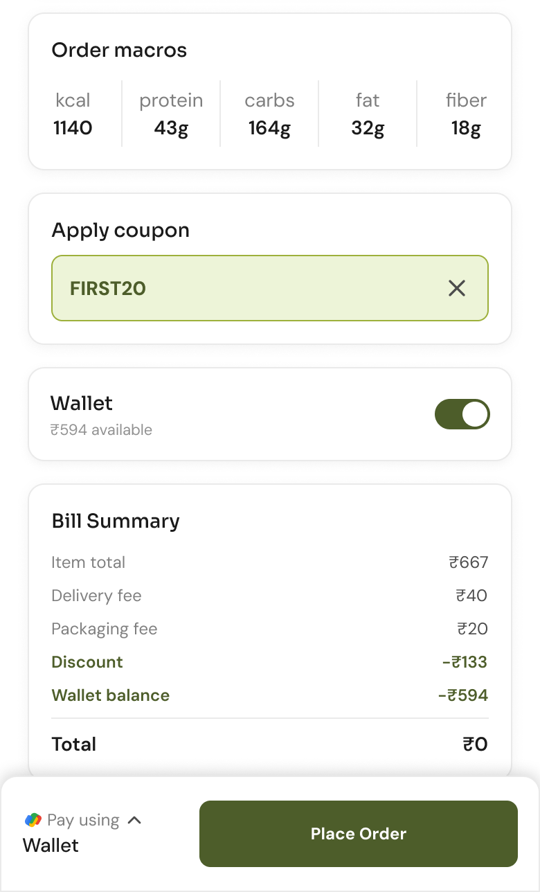
Credit from cancelled meals goes straight against the bill. When the balance covers the bill, the total drops to zero.

A client can track an order on its way from the cafe.
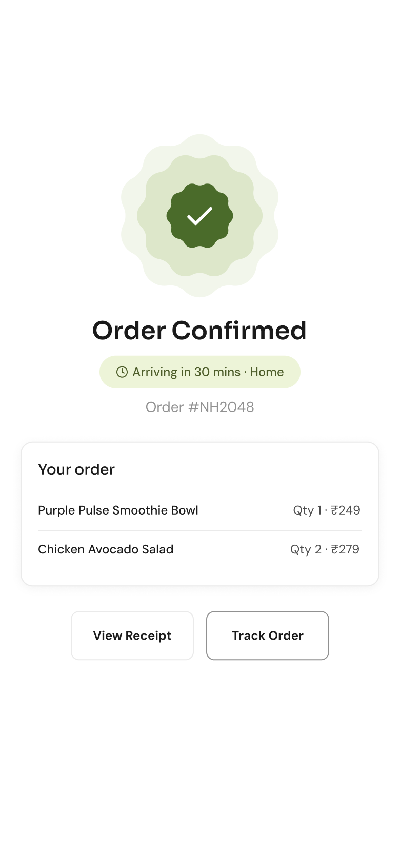
The client sees this screen once an order is placed.
Outcome
Every decision here fixes a problem before a single client could run into it.
NutraHive has not launched yet, so none of this has been measured.
Once NutraHive is live, the first thing I would check is how many new clients place an order before they fill in the nutrition profile.