A one-week design assignment

The Conductor's
Digital Companion

A ticket machine for one thumb, on a moving bus for a 17-hour shift.

Three tickets in 4.2 s of tapping, on a shaking chair, with cash in the same hand.

My part
Interview, research, design and testing
Designed for
One thumb, harsh sunlight and a moving bus
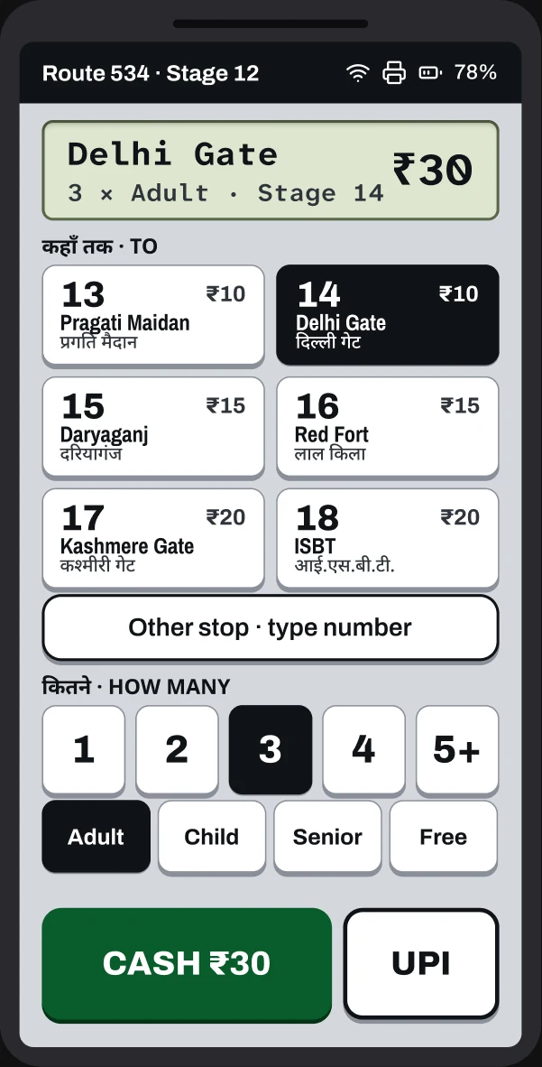
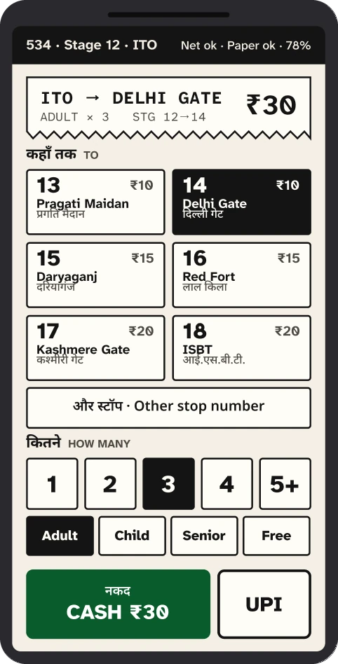
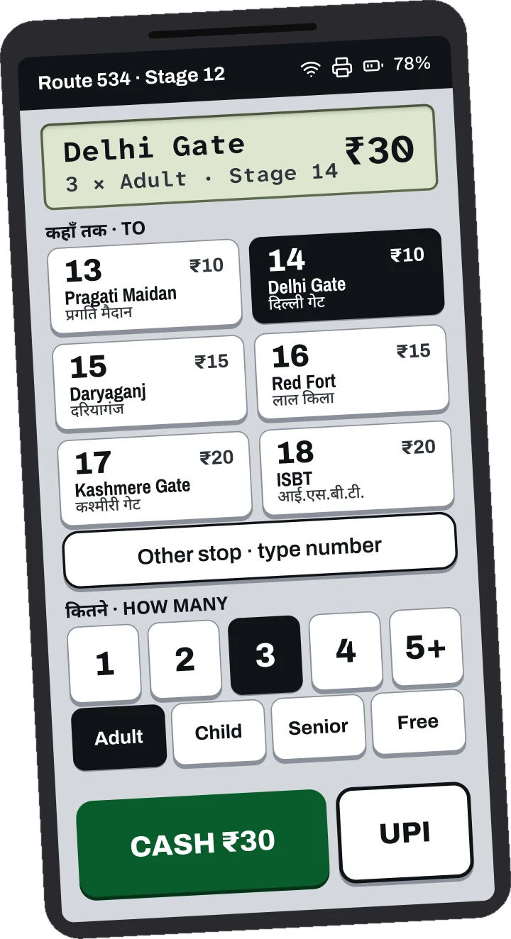
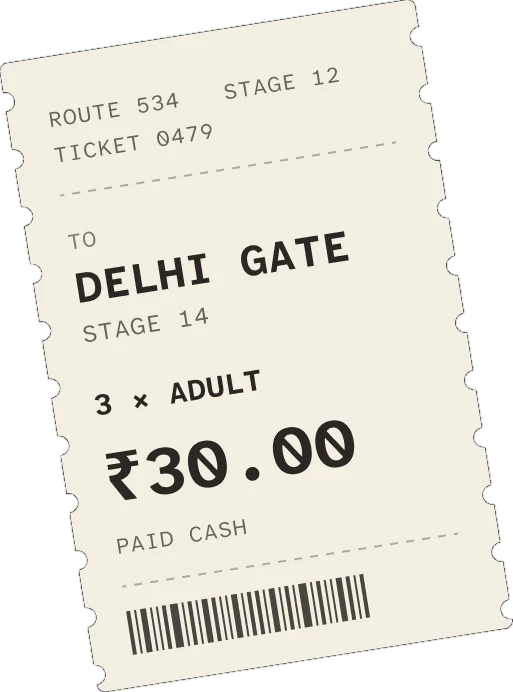
The ticket machine screen on a phone: Delhi Gate, 3 adults, 30 rupees, with stops, count and payment on one screenA printed paper ticket: route 534, stage 12, to Delhi Gate, stage 14, 3 adults, 30 rupees, paid cash

01The brief

Digitise the bus conductor's ticket machine.

Today's machines have worn buttons and screens you can't read. The brief sets three hard limits.

01

One hand

The brief puts cash in one hand and a phone in the other. On the bus, the cash sits in the same hand as the machine, so that thumb does the whole ticket.

02

3 tickets, under 4 s

Pick a stop and print tickets for three passengers in under four seconds.

03

Glanceable in glare

Readable at a glance, in harsh sunlight, all day long.

02Primary research

Primary research

“Three tickets in four seconds? I guess one ticket is also not possible.”
a veteran bus conductor (my friend's father)
₹10 | ADULT

When I shared the brief's 4-second target, this was his reply. He is my friend's father and has run the machine for years. Photos weren't allowed on duty, so he sent a walkthrough video instead.
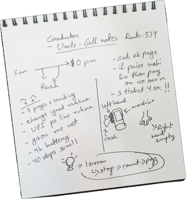
A handwritten notebook page of notes about the conductor's day on route 534my notes from the recorded talks
17 hshift, 5 am to 10 pm
~40stops on one route
10 to 20 sper ticket today
4 hbattery, then a charge

Seventeen hours, two rushes

Bus stand

Before the bus leaves the stand, every passenger has to be ticketed in about 5 minutes.

Rush hours

Office and school hours bring two rushes, about 3 hours each, one in the morning and one in the evening.

10 pm

At 10 pm the day's data is pulled over USB. If the cash comes up short, the gap comes out of his own pocket.
03Secondary research

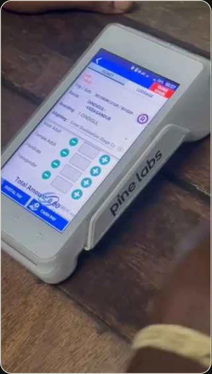
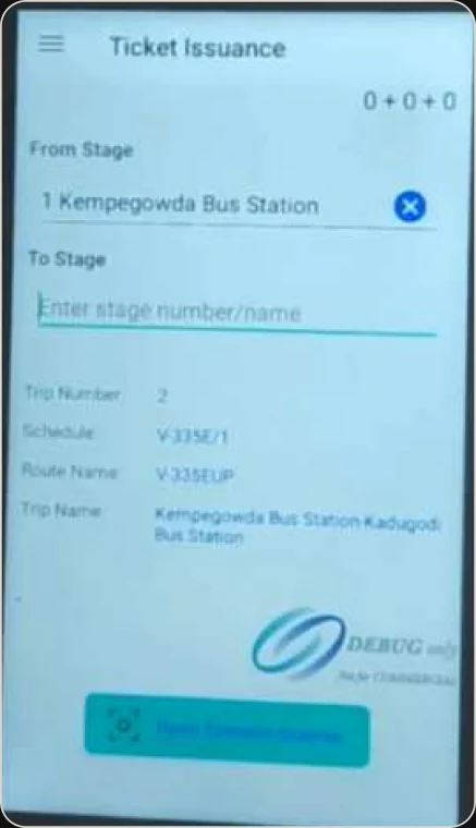
Two live ticket apps had the same problem. The ticket is spread over pages.

Photo of the TNSTC ticket machine, showing one screen with a flat hierarchy

TNSTC, one screen, flat hierarchy

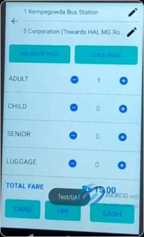
BMTC app, page 1: choose the stop

BMTC page 1, choose the stop

BMTC app, page 2: count and pay

BMTC page 2, count and pay

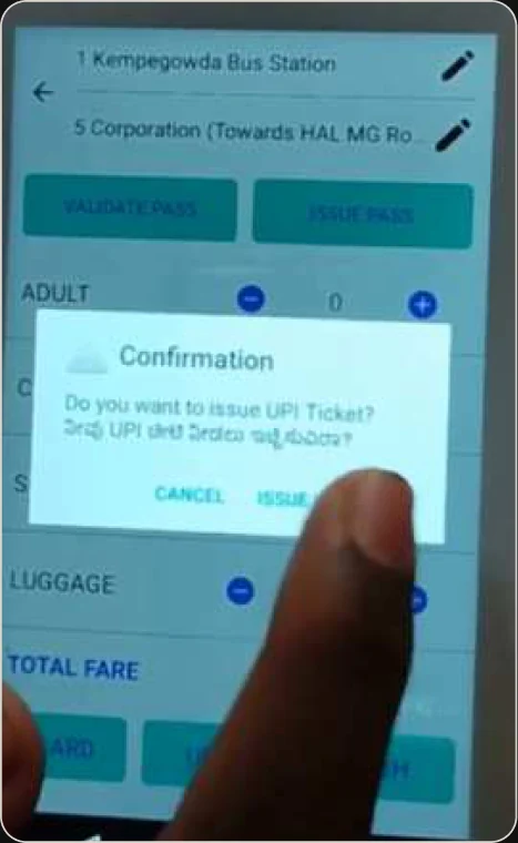
BMTC app, page 3: confirm UPI

BMTC page 3, confirm UPI

6 to 7taps for 3 passengers

So I wanted the stop and the count together on one screen, so he never waits for a page.

04Problems and rules

Five things that slow him down or cost him money.

P1

One ticket, three pages

Stop, count and payment sit on three pages, with loading in between.

CONDUCTOR

It would be better if it could be on a single page.

P2

Change lives in his head

When 3 or 4 people pay at once, he has to remember who is still owed change.

CONDUCTOR

If he doesn't take the money, he pays from his own pocket.

P3

UPI blocks the queue

While one passenger's QR is on screen, nobody else can be served.

P4

No signal on rural roads

On fast rural stretches the signal drops and digital payments fail.

P5

A 4-hour battery, a 17-hour day

He keeps a power bank and a cable in his pocket all day.

I turned his problems into eight rules. Six of them show on the main screen.

The main ticket screen: stops on top, count and type below, and the cash and UPI buttons at the bottom
1

High contrast, dimmer screen

Every text pair passes WCAG AAA, at 7:1 or higher. That lets the screen run dimmer and save battery.

2

Number first, next stops on top

Six big stops come first. Any other stop can be reached by its stage number.

3

One thumb can finish a ticket

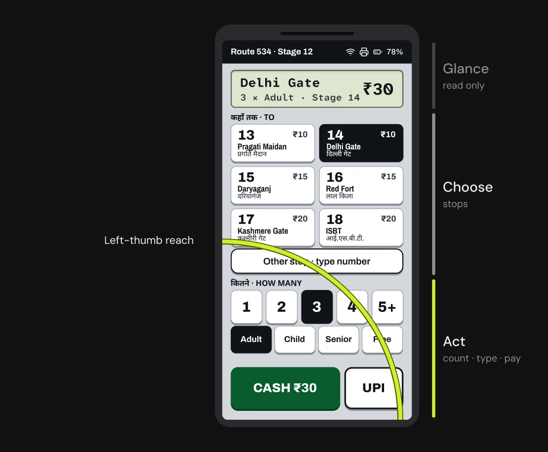
It is built for the hand that holds the machine.

4

Everything on one screen

There are no pages and no loading.

5

Big targets, taps only

Keys are 64 px or more. There are no swipes, and only Close Stage needs a hold.

6

UPI waits in the background

He can serve the next passenger. The ticket prints when the payment comes in.

Two more rules live on other screens. The machine remembers who is owed change, and a wrong ticket can be undone or voided.

05The design

Four directions from the conductor's world. One fit best.

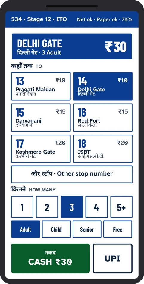
Direction A, ticket slip: a ticket stub at the top of the machine screen

ATicket slip

Direction B, transit signage: a navy route board at the top of the screen

BTransit signage

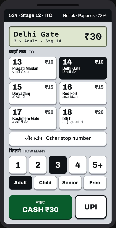
Direction C, physical keys: a grey body, raised keys and a green LCD panel

CPhysical keys

Chosen
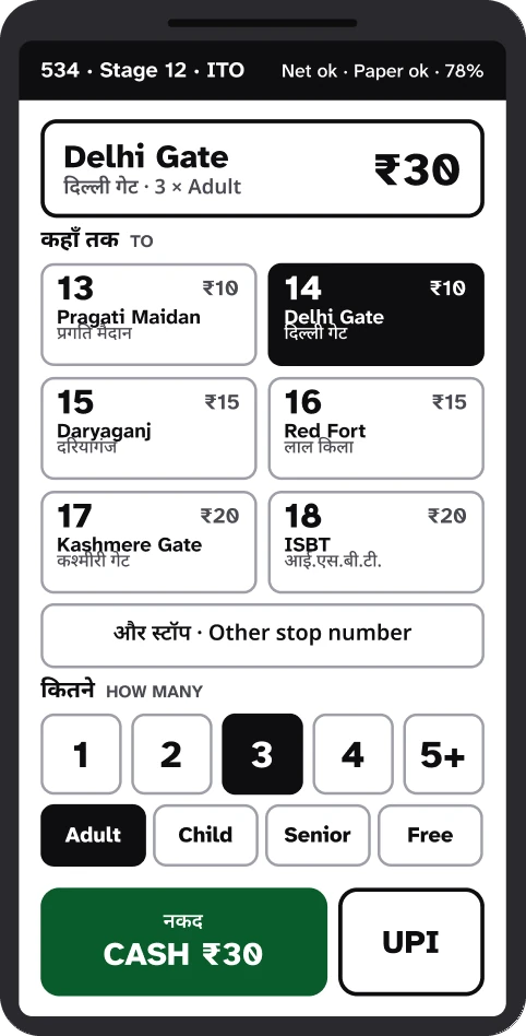
Direction D, plain high contrast: black on white with no decoration

DPlain high contrast

Why C

It looks pressable, like his old keys.

It has an LCD panel he already reads.

Its calm grey body keeps text at 7:1 or higher.

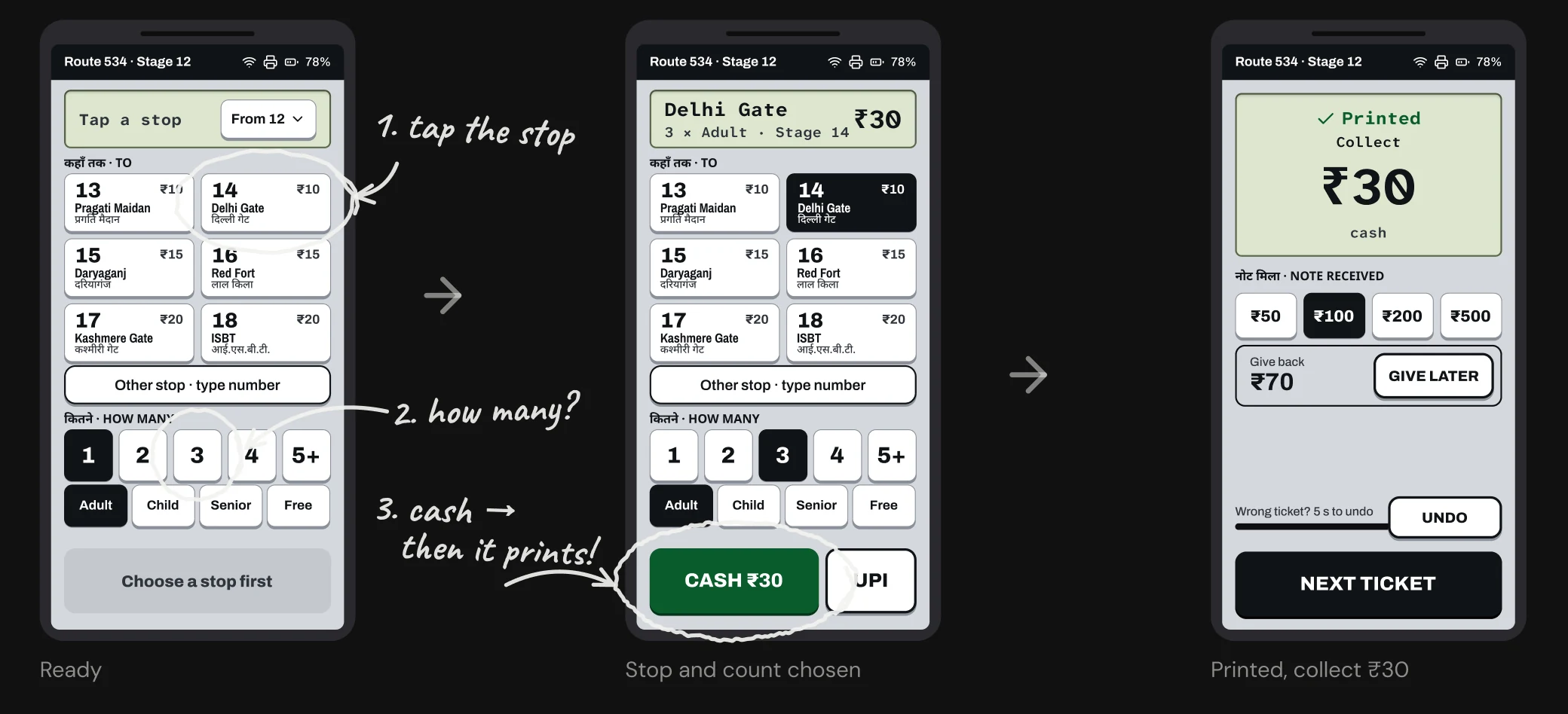
Three passengers, one stop, three taps.

Stop, count and payment sit on one screen. Count starts at 1 and type at Adult, so one passenger takes just two taps.

Three screens of the ticket flow with handwritten notes: 1. tap the stop, 2. how many?, 3. cash, then it prints! Captions: Ready, Stop and count chosen, Printed, collect 30 rupees

I designed the moments that cost him money or time.

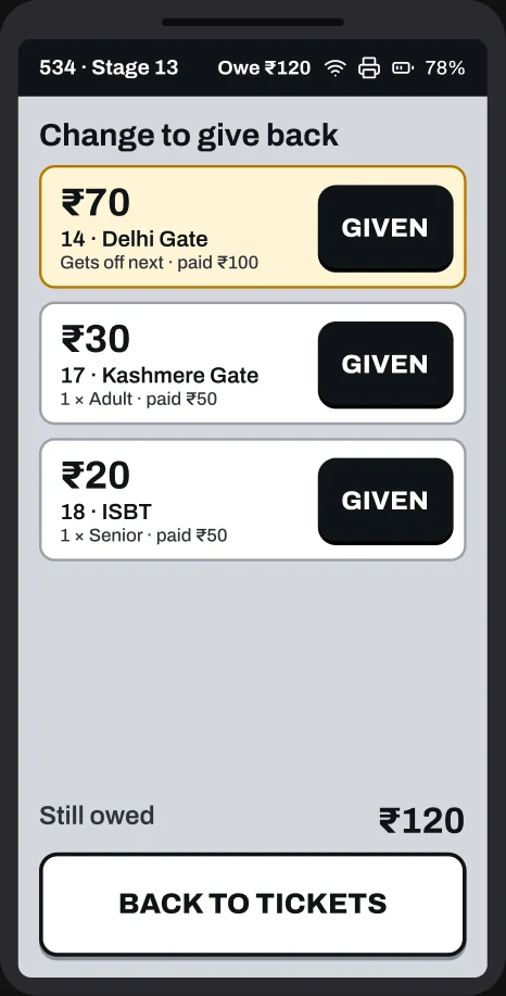
Change to give back screen, a list of tickets with a Given button on each

Change still owed

A list shows who is still owed change, sorted by the stop where they get off.

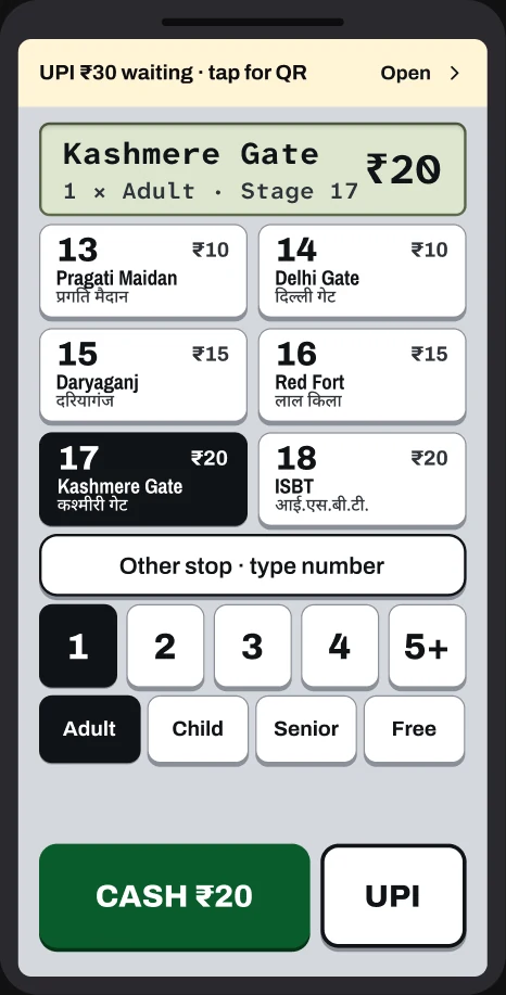
Ticket screen with a yellow bar at the top: UPI 30 rupees waiting, tap for QR

UPI keeps waiting

He can serve the next passenger while UPI waits. A yellow bar brings the QR back.

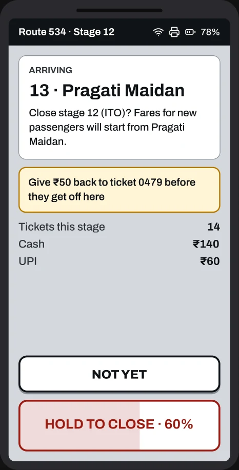
Close stage screen with a Not yet button and a hold to close button at 60 percent

Closing a stage

It asks at the right stop. It needs a press and hold, so a jerk can't close it by mistake.

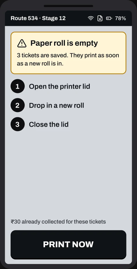
Paper roll is empty screen with three steps to reload and a Print now button

Paper runs out

Plain words and three steps to reload. Tickets already paid for print by themselves after.

Built around the thumb of the hand that holds the machine.

Taps only

There are no swipes on a jerking bus. Only Close Stage needs a hold.

64 to 84 px keys

They are bigger than the 44 px that WCAG asks for, for gloved or sweaty fingers.

Feedback without looking

A beep, a vibration and the printer sound confirm each ticket, so he doesn't have to look.

The ticket screen split into three bands: glance, read only; choose, stops; act, count, type and pay. A dashed arc marks the left thumb's reach

06The test

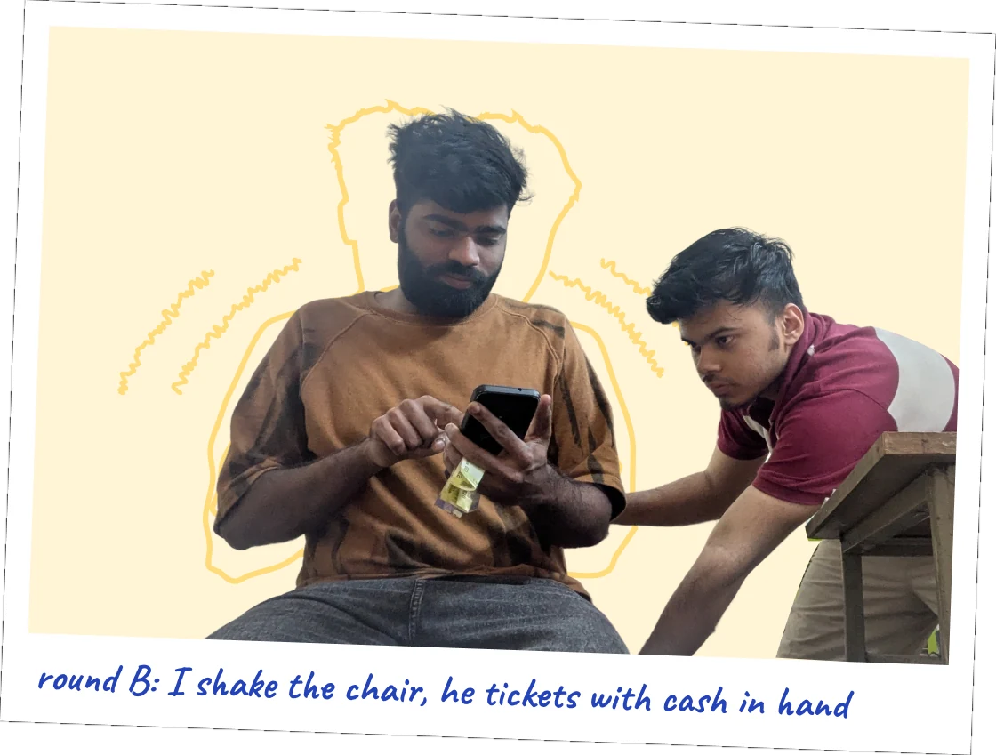
I tested it the way the bus would. The chair shook, and the cash sat in the machine hand.

1 tester

My friend, who is not a conductor. I count this as a limit.

2 rounds of 6 tickets

Round A was seated and still. Round B was on a chair that I shook by hand.

Cash in the machine hand

The notes sat in the left hand with the machine, like on the bus. There was no phone in the other hand.

Timed from the screen recording

From the end of my instruction to the moment the ticket printed, in 0.5 s steps.

A polaroid captioned round B: I shake the chair, he tickets with cash in hand

Results

3 passengers, one stop, taps only

Brief target, 4 s

Today, his count

10 to 20 s

Seated

2.0 s

Shaking, cash in hand

4.2 s
0 s5 s10 s15 s20 s

My times count taps only. On the real machine, printing and the UPI network add a few seconds. His 10 to 20 s includes both.

11/12tickets printed with the right fare
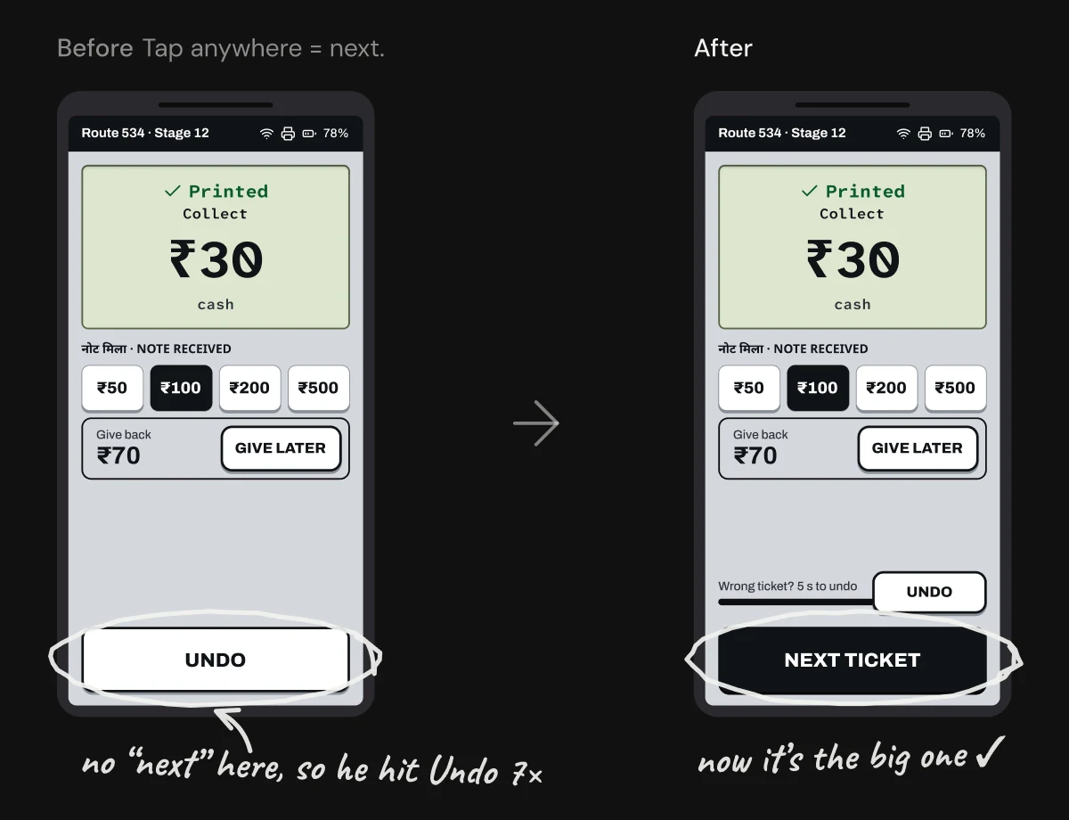
7×Undo was pressed when he meant next
5/12tasks needed a hint from me

Cash never waits for the network, and UPI waits in the background, so the queue keeps moving.

07What I changed

"Tap anywhere for next" was invisible. So he pressed the only button, Undo.

The printed screen before and after. Before, tap anywhere means next, and a note: no "next" here, so he hit Undo 7 times. After, a big Next Ticket button and a note: now it is the big one

What changed

  • "Next" is now a big NEXT TICKET button. Undo is smaller and says "5 s to undo".
  • "Serve next" is now "Next passenger, UPI waits".
  • The preview always shows the type, like "3 × Adult".

Trade-offs I kept, on purpose

  • Mixed groups tap the total, then the types. A plus and minus for each type would add taps to every ticket and need its own screen. One-time training covers it.
  • "From" stays a small chip. Boarding earlier is rare, so the space goes to the stops he taps all day.

08Limitations and next

One tester is a direction, not proof.

Limitations

One tester, and he is not a conductor.

I tested on a phone, not on the real machine.

Round A came first, so round B had a learning effect.

There was no phone in the other hand, as the brief describes.

Times count taps only, within 0.5 s, not printing or network.

Next

Test with a working conductor on a real route.

Check if one-time training is enough for the trade-offs.

Measure battery life with the dimmer, high-contrast screen.

Design login and route loading.