Alveolar
Redesigning the clinical screens of a dental practice platform
Alveolar is software that dental clinics use to manage their patients. Staff keep patient records, visits and treatments in it.
The product already had everything a clinic needs. The problem was where things sat. Information about one patient was spread across separate screens, so a doctor had to go looking for something that should have been in front of them.
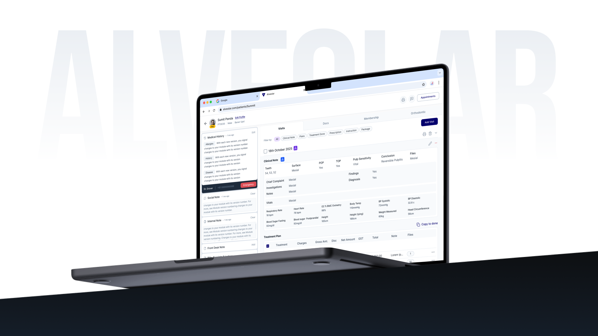
A unified patient profile designed to keep clinical information and visit actions within reach.
My Role
Designing the clinical screens
I joined a product that already existed. There was research, there were early wireframes, and the structure was set.
My work was the interaction design, the visual design and the developer handoff. The screens in scope were the Visit Flow, Documents, Membership, Patient Notes and mobile communication. Some of those had a wireframe to start from. Some had none, and I designed those from scratch.
Early wireframes developed into a consistent component and interface system.
Key Decisions
Three places where a small change made a clinical task easier to finish.
Made it obvious when a treatment was added
A doctor writes a treatment plan during a patient's visit. They pick the teeth, enter the treatment, and press add. The entry then appears at the top of the list on the right.
Adding a treatment plan entry, shown as it happens.
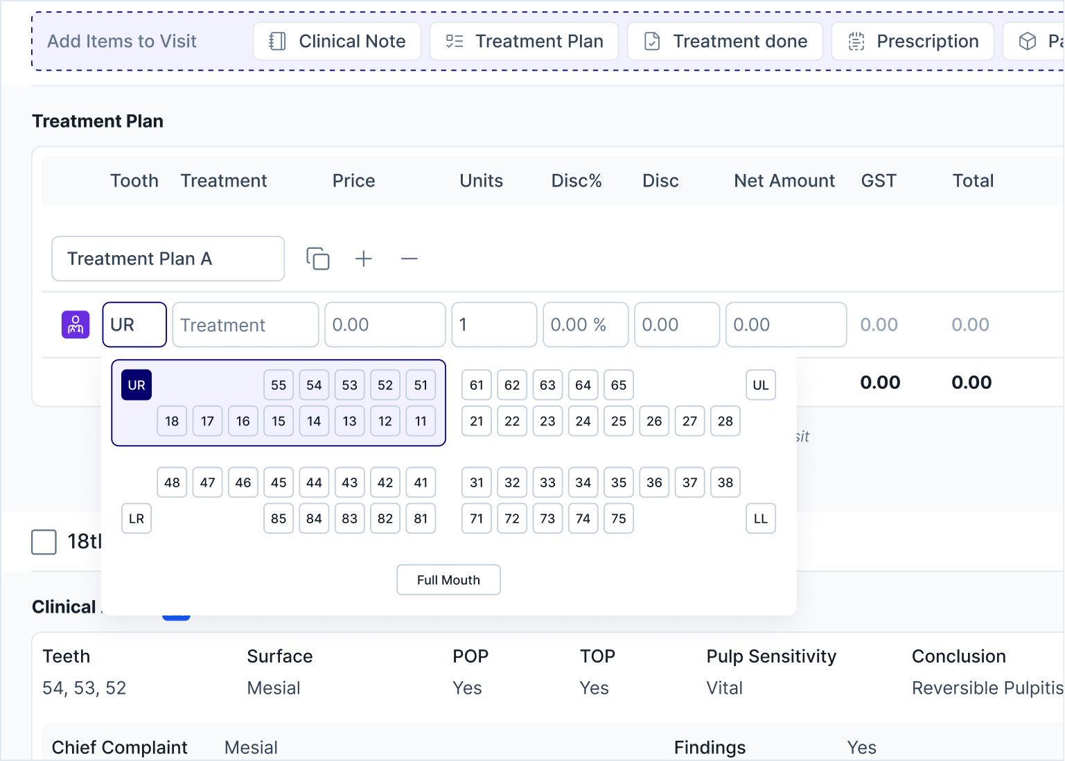
Selecting affected teeth before adding a treatment.
Attaching X-ray files while adding a treatment.
Made writing a prescription faster
After the treatment, the doctor writes the prescription. For each drug they set the dosage, when to take it, the duration, and the total quantity.
 Current design
 Previous design
Previous versus current Prescription design.
Made patient files quicker to find
A patient's file holds X-rays, lab reports, photos and consent forms. A doctor often needs one of them in the middle of talking to the patient.
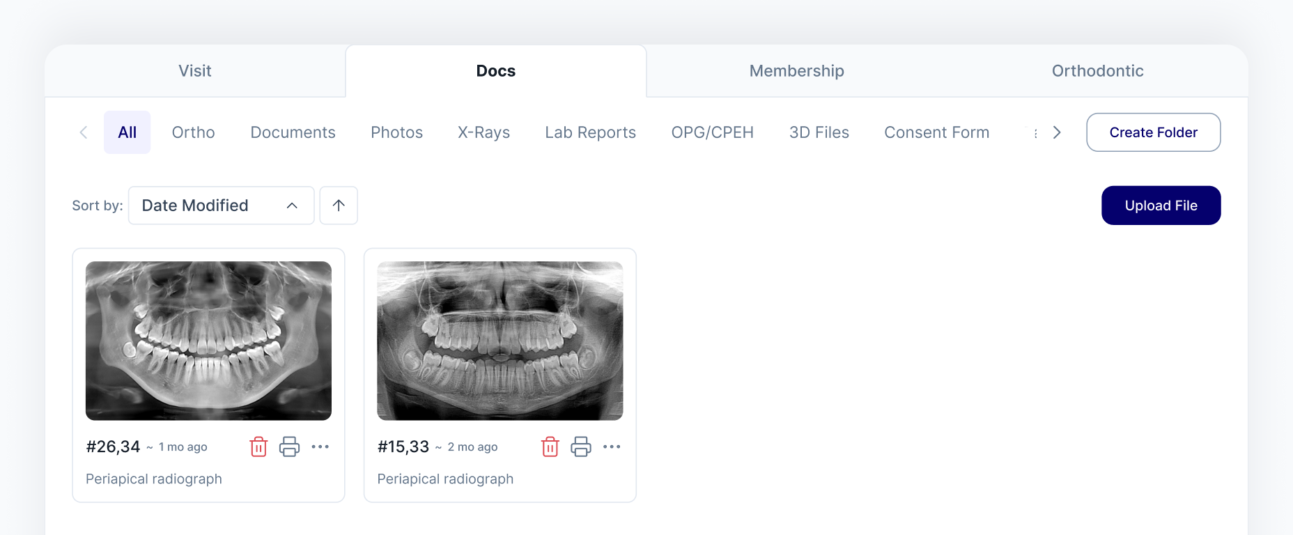
Photos, X-rays, lab reports and consent forms, filterable by visit or type.
Additional Work
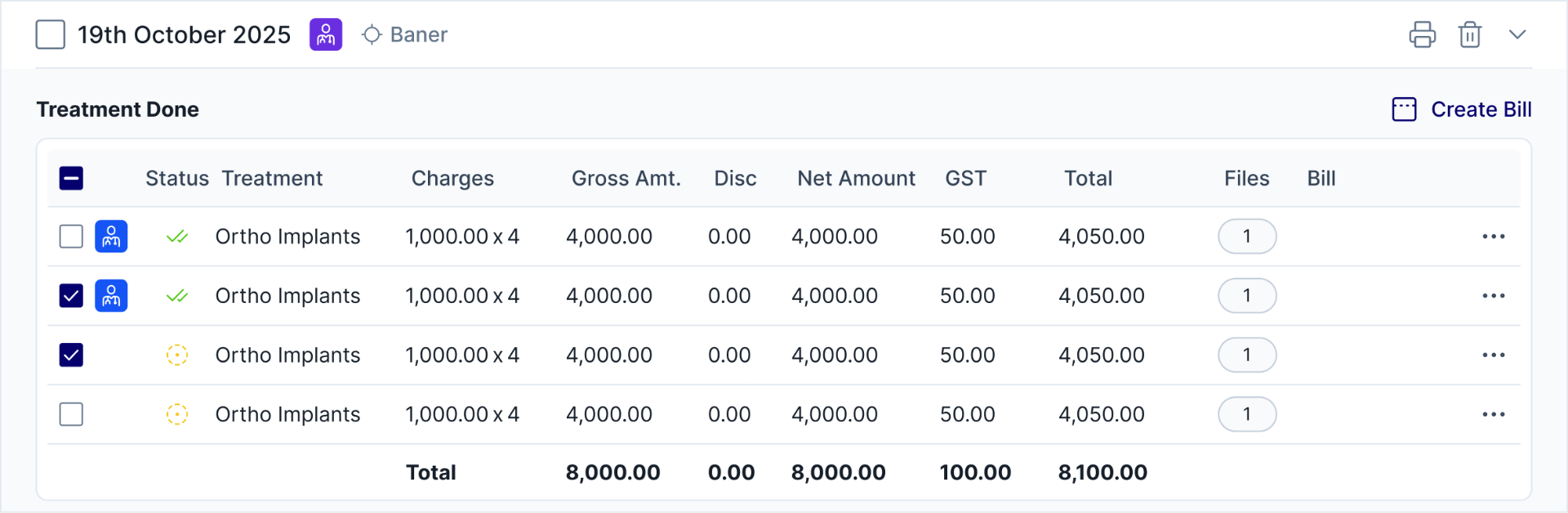
Completed treatments selected by checkbox, GST and totals calculated automatically.

Plan status and redemption, handled without leaving the patient profile.
Transition between normal and editable states across four note types.
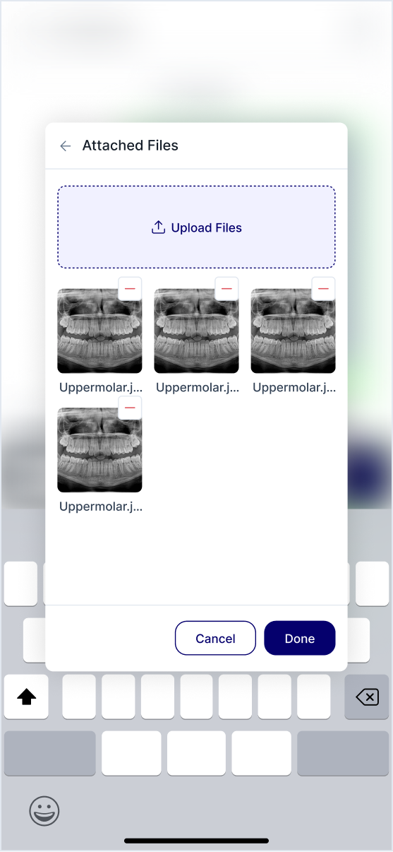
Reviewing attached X-ray files from a phone.
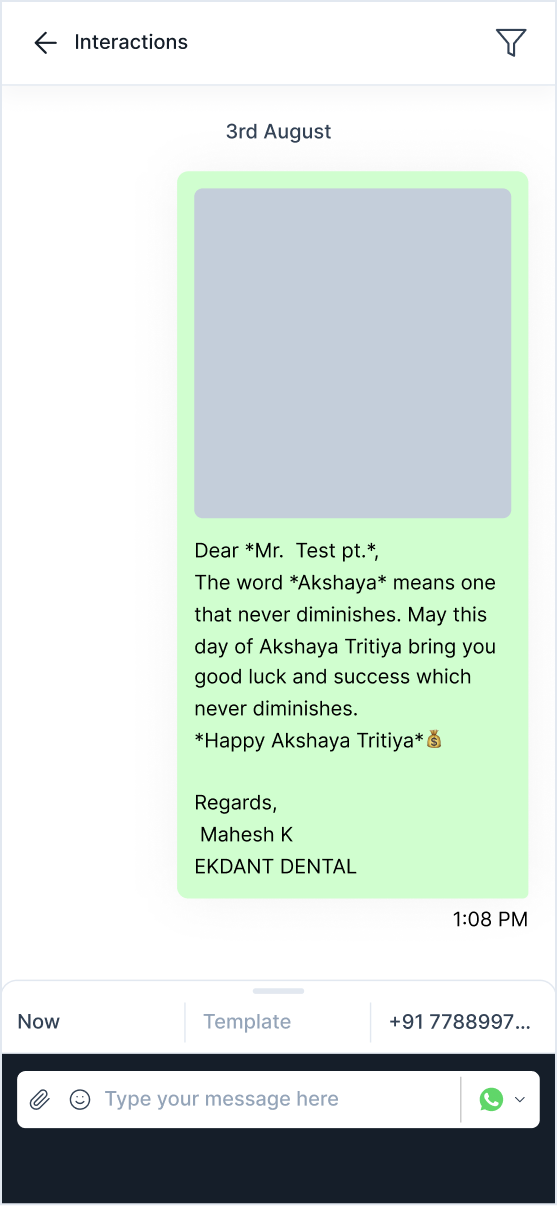
A WhatsApp message template sent from the patient's file.
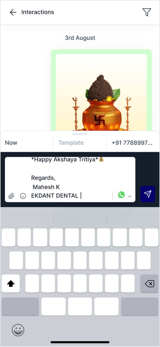
Editing a template message before sending.
Outcome
Alveolar has not shipped yet, so what follows is what each decision is meant to do, not what it has been measured doing.
The main thing I took from this project. If something important changes on screen, the signal has to be big enough to notice. A small colour change is not enough when someone is mid task with a patient in front of them.